반응형 웹디자인(responsive web Design)
=> 최근 다양한 사이즈의 기기가 생겨나며 필요성이 생김
"content is like water"
1. fluid layout을 위한 속성
=> flex grid, flex box, %, vw, vh
2. 보통 규격
mobile: 320px~480px
tablet: 768px~1024px
desktop:1024px~
3. 재배치 되는 기능: Media queries
@media screen/print/speech/all and/not/only/, (min-width:800px) {}
4. 반응형 웹 실습: 화면 크기가 줄어들면 네비게이션 메뉴 변경
① 기본 메뉴: 3개의 박스로 나누어 flexbox의 속성들을 이용하여 정렬
display: flex;
justify-content: space-between;
② 크기가 줄었을 때의 메뉴: @media 의 max-width 이용
@media screen and (max-width:768px){}
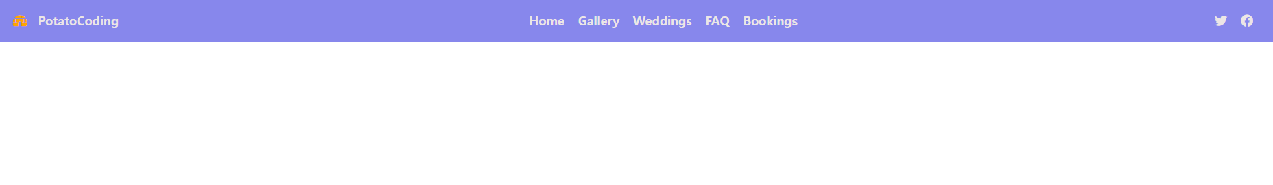
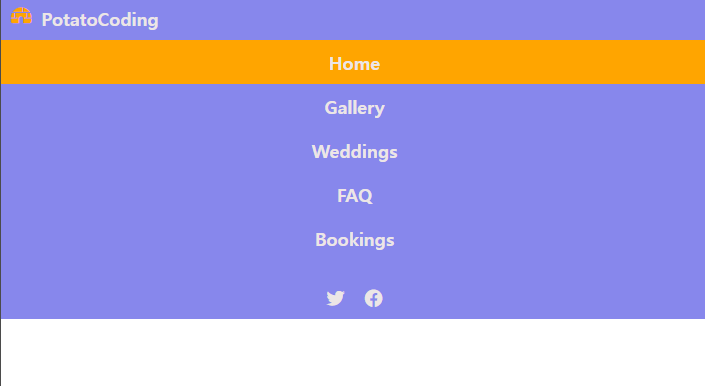
③ 결과화면
넓은 화면에서의 모습
화면이 줄어들었을때의 모습
🔔아이콘을 제공해주는 사이트: https://fontawesome.com/
Font Awesome
The world’s most popular and easiest to use icon set just got an upgrade. More icons. More styles. More Options.
fontawesome.com
🔔폰트: https://fonts.google.com/
Google Fonts
Making the web more beautiful, fast, and open through great typography
fonts.google.com
🔔Tip. Emmet 작성
1.html 양식: !->tab
2. .[classname]->tab: <div class=""> 자동생성
3. 자식노드 >, 형제노드 +, 여러개 반복 *, 부모노드에 추가 ^
4. text 입력: p{hello} , 자동 숫자할당: $
5. Responsive CSS Units
사이즈:
Absolute: px,,, => 페이지의 크기가 변하거나 사용자가 크기를 조절하여도 변경되지않는 단점이 있음
Relative units
- em: 현재 폰트 사이즈, 고정된 값, 8em등으로 부모의 폰트사이즈에 곱하여 사용
- rem: root element, root 요소에 상대적으로 결정
- lh: line height
- vw,vh,vmin,vmax: view port를 기준으로 결정
- %: parent related
'공부 기록 > 강의정리' 카테고리의 다른 글
| [드림코딩 by 엘리] 자바스크립트 기초 강의_(2) (0) | 2022.02.23 |
|---|---|
| [드림코딩 by 엘리] 자바스크립트 기초 강의_(1) (0) | 2022.02.18 |
| [드림코딩 by 엘리] 1일차 (0) | 2022.01.29 |
| [생활코딩] 최종 실습 정리 (0) | 2022.01.26 |
| [생활코딩] 4일차_JavaScript (0) | 2022.01.26 |